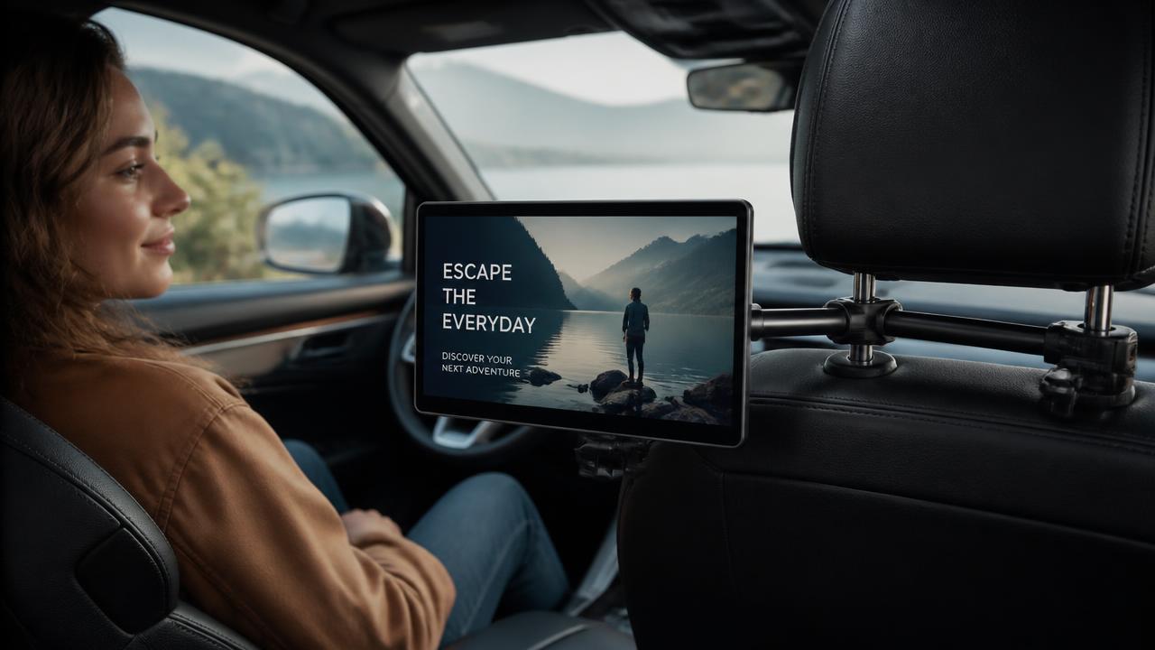
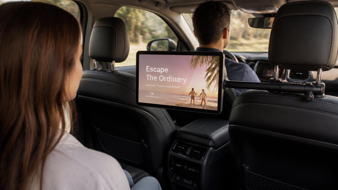
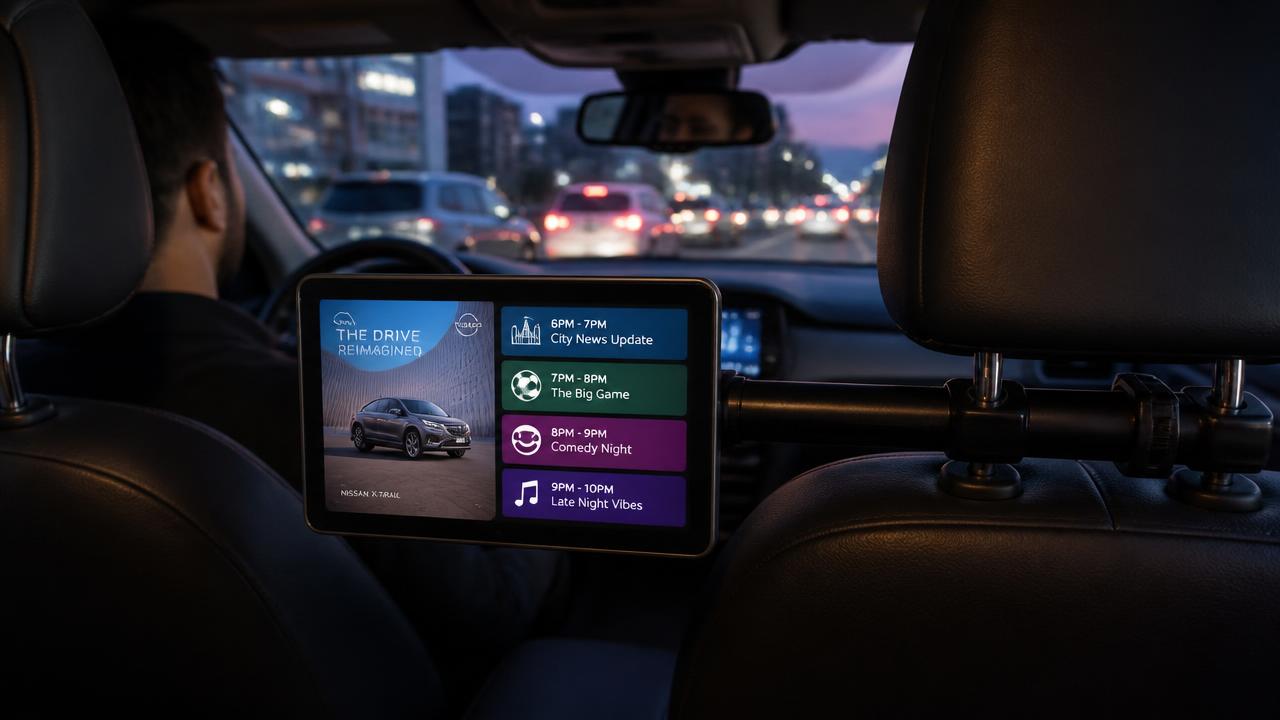
Designing Creative That Works on a Screen an Arm's Length Away
The design rules for in-cab are closer to signage than to film. Contrast, one idea, no sound, and a brand asset that survives a two-second glance.
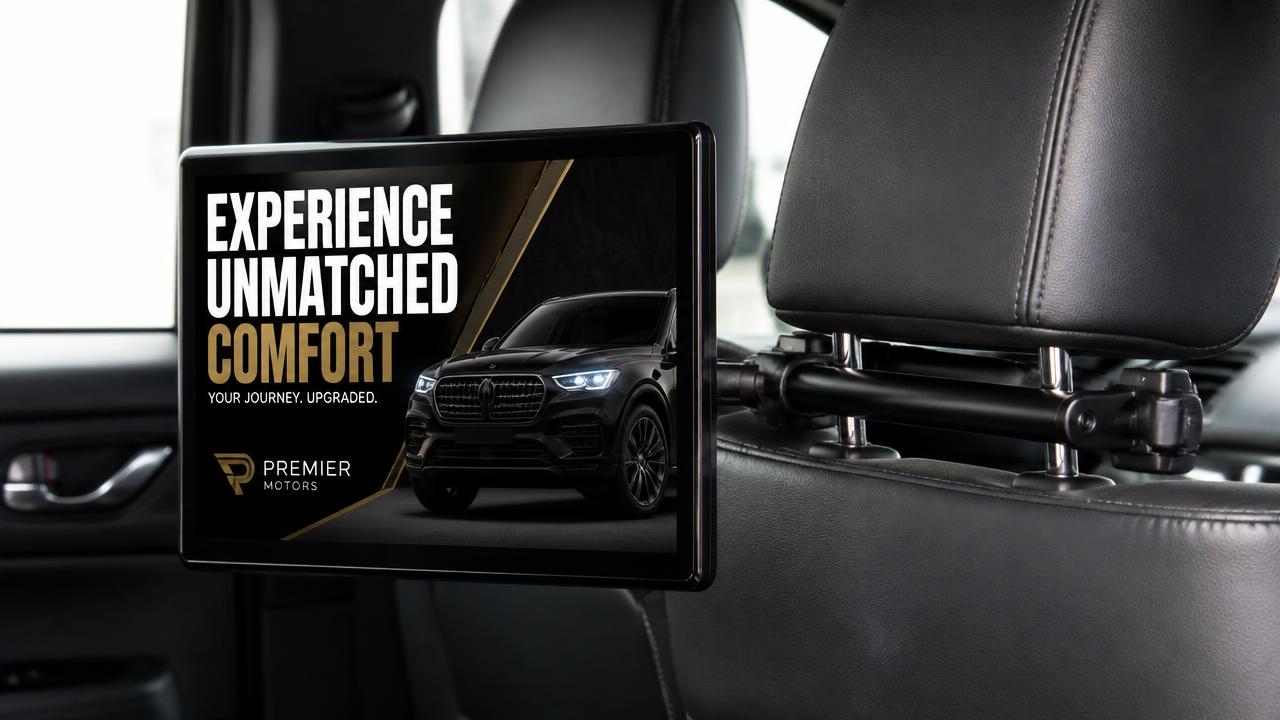
The most common mistake in in-cab creative is treating the spot like a short TV ad. It is closer to a piece of signage. It is viewed silently, from about an arm's length, by someone who did not choose to watch it.
Legibility beats beauty
- Set copy large enough to read while the vehicle is moving.
- Use strong contrast between text and background.
- Keep a clear margin at the edges; bezels and mounts eat the frame.
- Avoid thin fonts and tight spacing.
Design for sound-off, always
Cabin audio belongs to the driver and the passenger. Assume no sound will ever play. Anything a voiceover would say must also appear on screen, and any idea that needs timing must work visually.
Brand early, brand persistently
Ending on a logo is a TV habit. A rider may glance up at any moment, so a logo that only appears at the end is often missed. Keep a brand mark, colour block or device on screen for the whole spot.
Motion with restraint
A little movement at the start pulls the eye. Constant animation in a small cabin is tiring and makes people look away. Use one clear motion beat, then let the frame settle so the message can be read.
Print your key frame, hold it at arm's length and look for two seconds. If you cannot name the brand and the point, it is not ready.
Put your brand inside the ride
Share your objective and target corridors — we will come back with an inventory map, loop share and a measurement plan for your campaign.